
AmLaw Global 50 Aggregate Scores
| # | Score | Description |
|---|---|---|
| 1 | 93.7 | Brand identity/personality is not lost on smaller devices |
| 2 | 93.9 | User experience is superior regardless of device |
| 3 | 66.8 | Navigation for tablet and mobile should meet minimum threshold for touch targets. Apple recommends 44px by 44px, Android says 48 x 48px minimum |
| 4 | 81.4 | Content and images resize correctly and information hierarchy is maintained |
| 5 | 31.0 | Mobile site is available in non-English languages with ability to return to English |
Top Trends + Insights
Three Global 50 firms scored 100.0 on FBP 9 - Mobility. Sidley, King Wood & Mallesons, and Squire Patton Boggs. In the 2016 Study, two firms scored 100.0 (two different firms).
- In 2019, the lowest score achieved on this FBP was 50.0 (“poor”) – six firms received it. In the latest round of redesigns, mobile usability – especially phones – is getting short shrift.
- What does this mean to law firms? For global firms operating in emerging digital markets, it means that certain countries are mobile-first, such as India and many countries in Asia. In most African nations, mobile accounts for more than half of the website traffic – but in the U.S., mobile accounts for about 40 percent of website traffic.
Global mobile website traffic is 52.6%, which is not the highest it’s been (Q3 2017 was 53%), but it has seen a steady rise since Q1 2015 when it was 31.2%. A surprising number of Global 50 firms are still not strategic or deliberate in their design of the mobile version of their website.
The mobile share of total digital minutes in the U.S. in 2019 was 77%. Most U.S. legal services buyers are using both desktop and mobile equally during their business day. They may have different pages of your website pulled up on both their phone and desktop and will absolutely expect a seamless experience between them
- This heavy adoption requires website planners and designers to view their mobile site designs, content, features and functionality more strategically. The mobile experience your law firm offers must be effective, productive and harmonious for your visitors.
Scores on attributes # 1, 2 and 4 improved significantly over the 2016 Study.
- "Brand integrity/personality" went from 70.0 (“fair”) in 2016 to 93.7 (“excellent”). Only nine Global 50 firms did not score 100.0 and only one firm scored zero.
- "User experience is superior regardless of device" went up from 59.0 (“fair”) to 93.9 (“excellent”). 39 firms scored 100.0 and those that did not had phone usability issues.
- Attribute #4, "Content and images resize correctly and information hierarchy is maintained," also improved from a 59.0 in 2016 to 81.4 in this Study. 29 firms scored 100.0, but three firms scored zero because they didn’t pay attention to maintaining their information hierarchy. For example, the H-tags were jumping from H1 to H5, to H2 and H6, so the user experience was jarring. For those of you who don’t know what H-tags are, they are used to define HTML headings on websites. The H1 is the most important header and the H6, the least important. H-tags and the hierarchy they establish are equally important for both search robots and human visitors.
For attribute #5, "Mobile site is available in non-English languages with the ability to return to English," firms have not improved over the 2016 Study in offering translated content with the ability to return to English. In the 2016 Study, only seven of the Global 50 firms offered this and 20 websites didn’t offer any translated content.
- In 2019, 28 firms scored zero on this attribute – bizarrely, the number is significantly higher than it was three years ago. Scoring “zero” meant they either had no translated content or the functionality was impossibly broken in one way or another.
- Seven firms scored 100.0 where most or all content was offered in multiple languages.
- Several firms scored 50.0 or 75.0, where they, for example: 1) Offered only translated bio and/or office content or 2) titles, headers, and menu were featured, but not page content.
Another notable problem for several of the sites on phones was attribute #3, "Navigation for tablet and mobile should meet minimum threshold for touch targets. Apple recommends 44 x 44px, Android says 48 x 48px minimum."
- Eight firms scored zero – even firms with very recent redesigns. Researchers noted the following, as examples of their commentary: “The Menu on mobile is only 36px and the text is 12px. Very tiny on mobile.” And, “Menu navigation is very small — 24px on mobile and tablet.” Also, “Target hit is very low, 22 and 19px.” And finally, “Global Navigation is slightly under the hit target, but the People search is only at 19.2px.”
"Touch target” is the area of a screen that responds to user input (or touching). “Small targets are difficult to tap accurately. This requires more cognitive effort for the user and can leave them feeling frustrated and dissatisfied after making mistakes. Pressing a button is a simple task and if a user is unable to successfully tap on a button they may start to feel as if it’s their fault, which leads to a negative experience... In some cases, users will begin trying to use their fingertips for small targets, which will most often yield poor results.”
Standout Firms
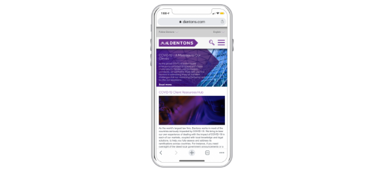
Dentons
This website has – on all platforms – the ability to change to eight languages that reformat the entire page on all pages of the site. It also “remembers” the last language setting and adjusts to the last saved option. The touch target is 43px, however the text is small at 15px.
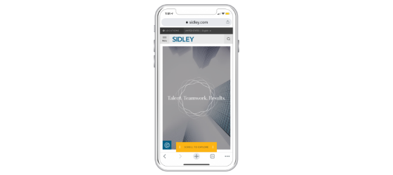
Sidley
Target sizes are up to standard – but the text could still be boosted in size. User can choose between Europe and American English as well as two Asia-Pacific languages. It translates menu/navigation and most pages (Offices, simplified Bios, About Us, etc.) but it does not translate the majority of news/publications content.
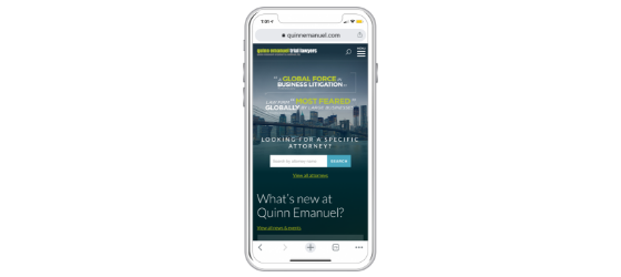
Quinn Emanuel
Also noted as a stand-out site in the 2016 Study, it remains a standout in 2019 not because of the design, but that it is well functioning. The translations apply to approximately 90% of the content on the mobile site. It’s easy to update/change the language on desktop/phone/tablet. The touch target is 42px not 44 on all the drop- downs, so that could be bumped up. The information hierarchy and use of the H-tags could be improved in the bios.
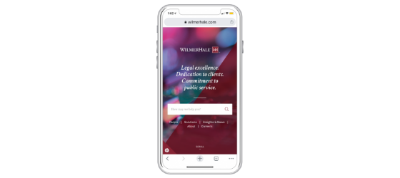
WilmerHale
Language selection is easy to use and can revert back to English. It changes various titles – but doesn’t change search titles. Unlike many of the other firms’ websites, this mobile site does change the language of the news pages. Note to the firm: The H-tags need some housekeeping – on the practice/industry details pages, “Key Contacts” is listed as H1 although the page title is already labeled as H1. Below that, “Related Solutions” is identical to “Key Contacts” and it is in H2. Finally, in 2020 it is unnerving not to have a hamburger menu to anchor the phone experience. We recommend adding it.
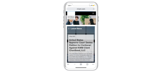
King & Wood Mallesons
Also a standout site in the 2016 Study, this is great mobile design with fantastic language support and visuals. The placement and size of the logo is curious – it’s almost lost on the home page on phones. But all in all, it's a great design and easy to use.
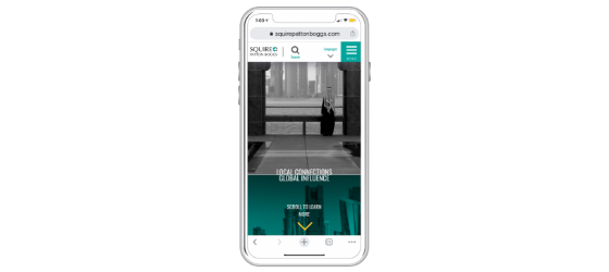
Squire Patton Boggs
Great functionality on the language options, although the only bios translated are for those lawyers that are speakers of or native to that particular language. The touch target in the global navigation is great; but the sub-categories under the Professionals’ search are slightly under. Well-organized and clean design.
Do's
| Do understand that global buyers of legal services come from most countries and continents. Ensure that non-American and non-UK prospects/clients and future personnel feel as welcome on your website as your American guests do. | |
| Do spend more time planning the mobile experience when you commit to a redesign. Too many of the AmLaw Global 50 firms made mistakes that are avoidable with better planning and design. | |
| Do include a well-designed hamburger menu on your mobile site. | |
| Do have more rigor when it comes to your information hierarchy and the proper and consistent use of H-tags throughout your site. They are critical for search engine and human accessibility and ease. |
Don'ts
| Don’t try to be “different” or “clever” on mobile. Meaning, ensure that mobile visitors’ table-stakes expectations are being met. That includes a hamburger menu with effective, well-spaced navigation titles. | |
| Don’t forget that you control how accessible your content is to your visitors. If someone with larger fingers can’t easily select and travel to the content they want, they’ll not tolerate this frustrating experience. This paints you in a bad light and they feel – on some level – that they are wasting their time with you. | |
| Don’t forget the value of video and podcasts on your mobile versions. We have clients whose analytics prove that visitors view videos at least twice more often on a mobile device than a desktop device, and after viewing a video, they stay on the website three times longer, viewing 3-5 more pages. | |
| Don’t rely on Google translate for the translations on your mobile (or any) device. It can be highly unreliable. |


